
Project
Lobby Portal
A touchscreen kiosk to bring the Entertainment Technology Center's highlights to life for its visitors.
I'm also responsible for proposing the concept, designing kiosk information structure, conducting user tests, programming in Unreal Engine 5, creating tools for easy updates, and writing technical documentation to instruct people on the process.
Info
Role
UX Designer & UI Developer & Producer
Platform
PC
Engine
Unreal Engine 5
Timeline
Jan 2023 - April 2023
Team Size
6
Overview
Problem
The tour of Entertainment Technology Center (ETC) building is amazing but lacks some interactivity and exploration. How might we help them to create an experience that inspires visitors to explore and learn about ETC?
Solution
We are creating a touch screen information kiosk that prioritizes simplicity and clarity and provides concise and informative content that engages visitors in learning about the Entertainment Technology Center and leave them wanting more.
End Results
An Interactive Kiosk
for Visitor Engagement
For four months, I led the development of the lobby portal for the Entertainment Technology Center's lobby, designed to engage visitors with insights into student projects and the center's offerings. From concept to execution, including information structure design and user testing, I handled it all. I also programmed in Unreal Engine 5, built update tools, and wrote user guides. This kiosk not only guided visitors effectively but also highlighted the center's creative pulse.
This kiosk, placed in the first-floor lobby on occasions when available, became a key tool in navigating the diverse offerings of ETC and its co-inhabitants, successfully enriching the visitor experience and showcasing the center's characteristics.
Uncovering Issues
I was tasked by the Entertainment Technology Center (ETC) department to improve the tour experience. Post-COVID-19, as in-person tours were reinstated for the first time since our enrollment, our team initially lacked firsthand experience with the ETC tours—neither having participated in nor conducted one. To bridge this gap, we commenced our project by engaging with faculty members for a comprehensive tour of the facilities. This initial step was followed by conducting interviews with relevant stakeholders to gather diverse perspectives and insights.
01 Stakeholder Insights -
Highshool Visitors
There are many highschool visitors in our department. So in our study, I introduced Kinect demos to a group of highschool visitors as a subtle way to engage and while they were having fun, I casually inquire about their tour experiences. This "head fake" tactic wasn't just for fun—it was strategically chosen for research purposes:
-
Natural Interaction: It allowed observation of genuine behaviors without the usual observer influence.
-
Honest Feedback: By disguising the study's focus, we reduced the likelihood of biased responses.
-
Real Reactions: We captured authentic emotional and cognitive reactions, crucial for empathetic UX design.
-
Contextual Insights: This approach gave us a realistic view of user interactions, informing more user-centered designs.
I found that while participants loved the hands-on experience in ETC (like games from the past student projects), they left with limited knowledge about ETC's history and its current states.

Highschool students playing our demo

Casually asking questions in the back
02 Stakeholder Insights -
Faculty and Staff
We conducted interviews with the ETC faculty and staff to explore their needs and gather suggestions for improving the guide tour experience. The goal was to gain insights from their perspective as experts in giving tours and to gather feedback that could inform the design process.
Guide Assistants are really important, for the tour and demo rooms. They can explain what's going on.

Janice
Administrative Coordinator
We need to surprise the kids during the tours..

John
Director of Educational Outreach
Prospective students are looking for a fun and engaging experience.

Rebecca
Director of Admission and Marketing
I wanted to tailor the tour to the potential clients' interests.

Drew
ETC Director
We conducted interviews with the ETC faculty and staff to explore their needs and gather suggestions for improving the guide tour experience. Our goal was to gain insights from their perspective as experts in giving tours and to gather feedback that could inform the design process.
03 User Persona Analysis
Drawing on insights from interviews and our own observations, I pinpointed our project's main audience: high school students, current ETC students, alumni, and potential clients, who are the most frequent visitors on guided tours. Based on this, we crafted four personas to guide our design.


I also identified the user needs that we want to prioritize:
-
Having a better understanding about ETC
-
Viewing ETC’s past and current projects
-
Exploring technologies and platforms being used in ETC
-
Taking pictures with pop culture statues scattered around the building
Finding Solutions
01 Ideation
According to the interview, visitors will receive a paper tour guide that includes a schedule for different groups to visit. The tour begins with an overview introduction of ETC at the main room, followed by a tour for several floors. Visitors will then have the opportunity to explore and experience hands-on activities with different technologies in the demo room and project rooms.
This insight led me to propose the design of the "Portal," a touchscreen information kiosk, to fill in some gaps and enrich the tour experience, addressing feedback and identified needs effectively.

02 Prototyping
I developed initial interface and user flow ideas through sketches, progressing to a low-fidelity prototype using Figma.
And then provided visual references served as a visual guide for artists to create the final game-ready UI components.

Initial Sketches

Lo-Fi Prototype

Visual Reference

Hi-Fi Prototype
Playtesting & Iterations
01 Playtest Results
In the weekly playtests, spanning 25 internal and 60 external sessions, I tried to understand how intuitive and engaging our kiosk design was, and gather insights on how to improve the design.


Weekly Playtests
02 Iterations
01 Tab and sub-tab layout

Before
Sub-tabs were placed in the middle under the main tabs, leading to visual clutter and inefficient navigation.
Less used information was taken too much space at the bottom.
After
Based on playtest feedback, I reorganized the sub-tabs to sit directly beneath their corresponding main tabs. This change reduced visual clutter and streamlined transitions, making navigation more intuitive and reducing the cognitive effort required to use the interface. I removed the event part to make more room for main menu.
02 3D Map Legend

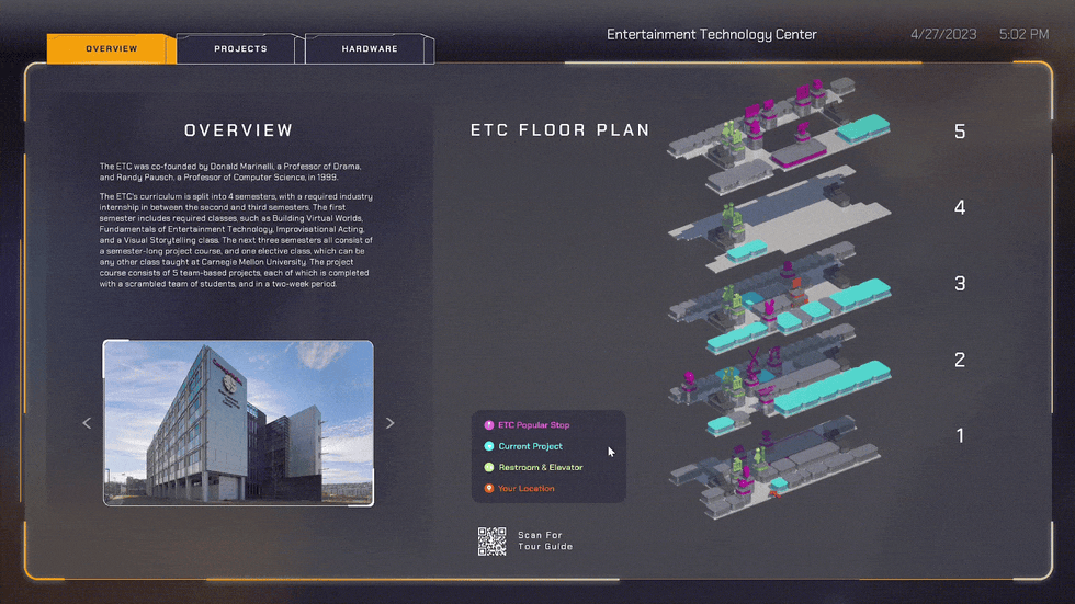
Before
The original 3D map legend was non-interactive with vibrant colors that naturally drew playtesters to attempt clicking on them, however, this action had no function, which caused confusion.
After
I redesigned the legend to make the colorful elements clickable. Now, clicking on these elements highlights the corresponding areas on the 3D map, making the legend not just informative but a dynamic tool in the navigation experience.
03 Floor Navigation

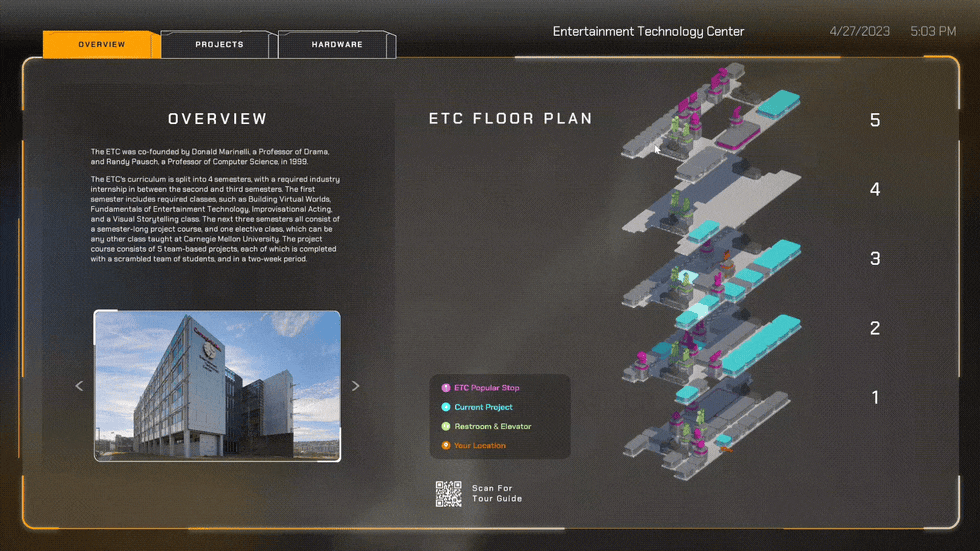
Before
Changing floors in the building's 3D view required users to return to the main building menu and manually select a different floor, which was cumbersome.
After
I simplified the floor navigation process. Users can now seamlessly transition between floors with direct "up" or "down" controls while viewing a specific floor, eliminating the need to backtrack to the main menu.
Technical Challenges
Touch Interaction Optimization:
-
Enlarged clickable areas following Fitts's Law to enhance ease of use.
-
Simplified navigation flows based on the Gestalt principles to support intuitive user interactions.
-
Responsive layout for potential iPad usage.
Backend Database Integration:
-
I designed and implemented a backend database to support the data-driven dynamic widget, ensuring dynamic content updates and interactions. This setup involved meticulous coding and testing to ensure data consistency.
Content Updating System:
-
Designed and coded a blueprint-based content updating system in Unreal Engine for content updates.
-
Included non-technical staff and student training on using the system, with step-by-step written guides and visual aids.
Technical Documentation:
-
Crafted clear, concise documentation with visual aids to detail the UI update process.
-
Created a quick-reference troubleshooting guide for common issues and resolutions.
Conclusion & Lessons Learned
Project Impact Assessment
We held an open community playtest by utilizing the event at ETC and let visitors use the portal for guidance around the building. We then invited them to fill out the survey.
The results were encouraging:
-
94% of testers easily grasped the content
-
89% navigated the interface without a hitch
-
82% found it to be fun interacting with the 3D models—a core feature that brought our designs to life
Lessons Learned
01 Strategic Innovation
Given the task of enhancing our department's tour experience, I jumped right in with Unreal Engine, a tool I was both familiar and interested in. My goal? To go beyond what traditional platforms offered and deliver a guide that was not just informative but visually appealing. The result was an interactive kiosk that showcased the engine's capability to produce high-quality renders, making checking the map not just some tasks, but an experience of itself.
02 Design for Touch
By actually building a touchscreen project, I learned its differences from traditional mouse and keyboard interactions. I learned to prioritize direct, tactile engagements, ensuring users could intuitively navigate through simple gestures and touches. This shift towards touch-centric design demanded a focus on simplicity and immediacy, ensuring every interaction was both visually appealing and effortlessly intuitive.