Project
Agents of Influence
A spy-themed game designed to teach students about making informed decisions. Through engaging narratives and hands-on activities in various settings within the game, players explore and interact with different technologies, learning to evaluate information critically.
I'm responsible for designing the UI/UX from wireframe to game-ready assets according to game design document, revamping old UI design and developing UI in collaboration with other programmers.
Info
Role
UI Designer & UI Developer
Platform
PC / Tablet
Engine
Unity
Timeline
Sept 2023 - April 2024
Recent Results
From concept development to the final implementation, I managed all aspects including UI/UX design, rapid prototyping, and iterative feedback integration. and collaborated with programmers to integrate the UI into Unity.
Design Process
Redesign the UI/UX
I was brought on board to redesign the UI system, tasked with transforming the UI to enhance usability and aesthetic appeal. This involved a complete overhaul from the ground up, focusing on streamlining interactions and updating the visual design to align with current user expectations and technological capabilities.

Iterations on Vocabulary menu Mid-fi

Iterations on Conversation Game interface Mid-fi

Final Screens

Side by Side Comparison

Before
The original in-game UI had cluttered HUD and buttons, reducing clarity and gameplay efficiency. The dialogue boxes were also visually cumbersome, detracting from player immersion.
After
The redesigned HUD and buttons are now grouped together based on their function, enhancing visual clarity and interaction ease. I redesigned the menu into a diegetic UI, resembling a smartwatch that serves as an information hub. The dialogue box UI has been overhauled to be cleaner and more engaging, improving narrative delivery and player experience.

Before
The original pause menu used basic visuals with a minimal flat design. Players were confused about the number on top left conner.
After
I revamped the pause menu by adding textured details and irregular shapes. And I lowered the transparency, giving it a floating appearance that clarifies the menu's layering over the game, aiding player navigation and understanding of menu relationships.

Before
The original Character(NPC) menu was cluttered, making it difficult to read and navigate. All game information was cramped together, complicating user interaction.
After
The new design organizes data more effectively, and also incorporates newly requested features for tracking relationships and locating NPCs.

Before
The old UI featured two separate tabs for documenting "media literacy" words and "vocabulary", leading to fragmented navigation and user experience.
After
The redesigned menu consolidates media literacy and vocabulary into a single menu with a sorting system for easy filtering of different words. Players collect word cards as they play. They can engage with their card collections digitally, and teachers have the option to print the cards for physical review and memorization.


Before
The Evidence was previously housed in a separate menu, making it cumbersome and disconnected from other game information.
After
It is essentially an inventory menu. So I integrated it into the smartwatch UI, unifying it with the rest of the game’s information systems. By applying the same design elements used in the NPC menu, the new layout allows for displaying more items and simplifies the process of locating and using specific items, enhancing overall usability and player experience.
UI Style Guide
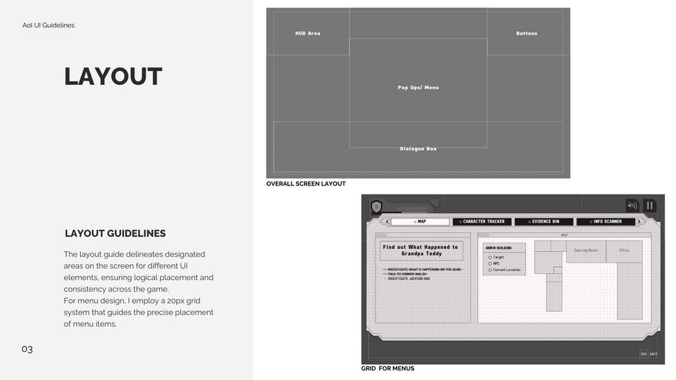
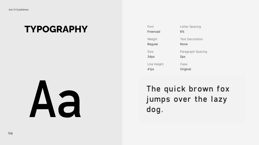
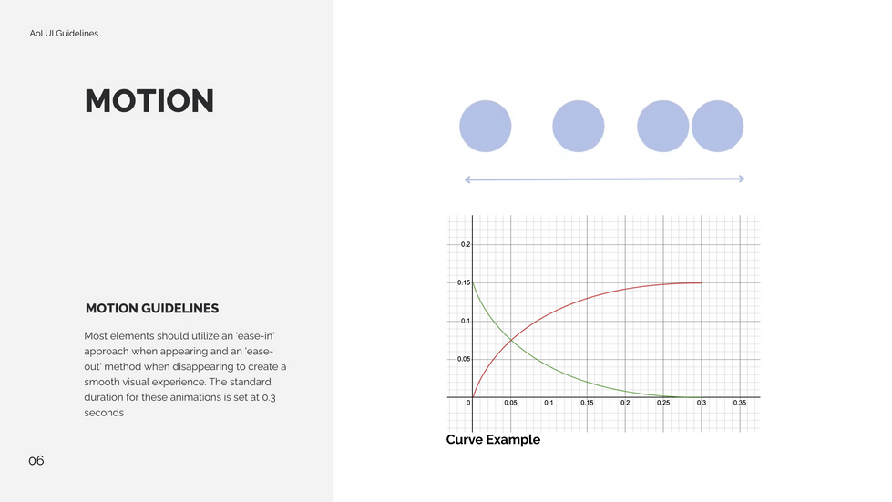
Build a Robust UI Style System
Lessons Learned
01 Enhancing Intuition and Efficiency in UI Design
In redesigning the game's HUD and buttons, I employed Gestalt principles to improve visual organization, ensuring intuitive connectivity between related functions. This strategic reorganization, coupled with an analysis of button functionality, streamlined user interactions by aligning with player expectations and reducing cognitive load, enhancing the overall user experience.
02 Building Consistency with a UI Style Guide
Creating a UI style guide was important in building the visual hierarchy throughout the game's interface. Building this system helped standardize colors, fonts, and layouts, ensuring a cohesive look and feel across all screens. It also made design process faster and easier by maintaining consistency across every element of the game.


